Graphics are an efficient way to communicate information and make presentations more visually appealing. It's difficult to write a general prescription for effective graphics, but you can improve your own graphics by avoiding certain practices and imitating the better aspects of others' work.
Recommended Books
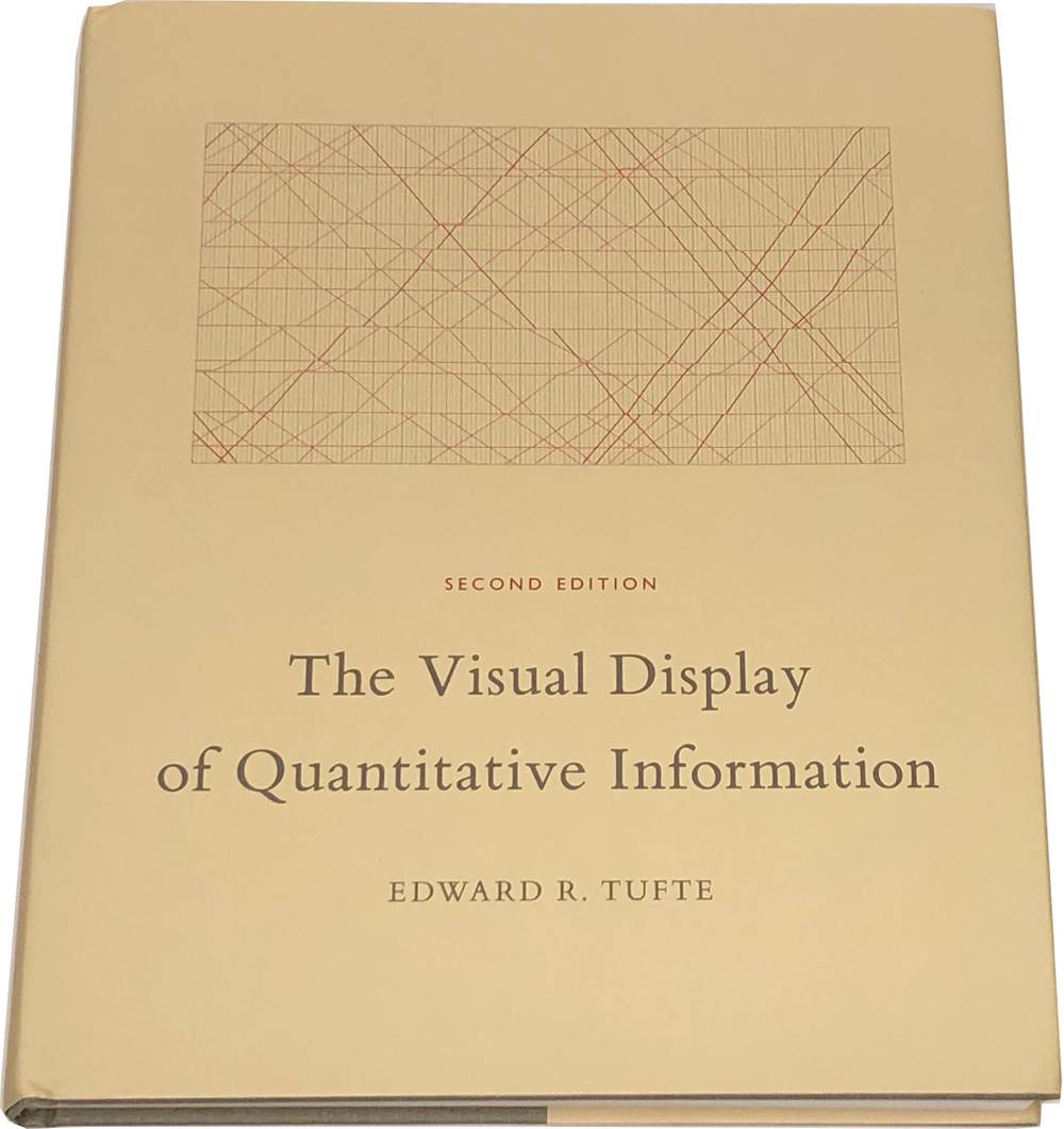
The Visual Display of Quantitative Information
Edward R. Tufte

Key Features
Key Topics
- Aesthetics and Technique
- Avoiding Distortion
- Chartjunk
- Chernoff Faces
- Data Density
- Data-Ink Ratio
- Enabling Comparisons
- Examples of Excellent Data Graphics
- Maps
- Moiré Vibration
- Multifunctioning Graphical Elements
- Principles of Graphical Excellence
- Proportion and Scale
- Redesign of Common Statistical Graphics
- Reflecting the Hierarchical Structure of Data
- Small Multiples
- Time Series
- Useful Redundancy
Description
If you are interested in data graphics, you must read this book. For one thing, this is the canonical book on data graphics; it popularized notions like data-ink maximization and chartjunk. It is also chock-full of beautiful and effective data graphics worthy of imitation. Finally, Tufte is an incisive critic of data graphics, and you can almost always improve your own graphics by optimizing his criteria. We feel the Visual Display of Quantitative Information is Tufte's best book, but he has published three more in a similar, if occasionally somewhat repetitive, vein: Visual Explanations, Envisioning Information, and Beautiful Evidence.